The Solar System (and maybe more!) in your pocket!
The end of the regular development of VRUniverse is approaching quickly. The app designed for google cardboard is becoming more and more polished and cohesive, with the different parts each team member developed fitting together exceedingly well, with most of the hoped for functionality being implemented. From the final menu to the scaled sun shown from each planet and the text boxes throughout the app, much has changed since the last update, and all for the better.
Main Planet Views
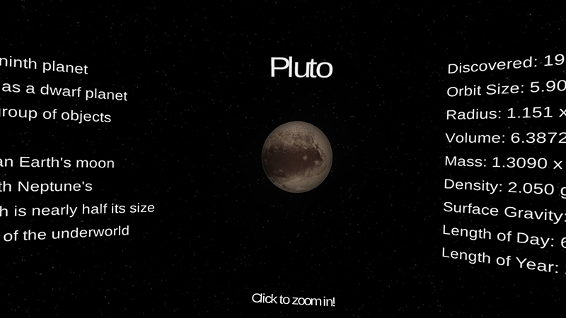
Our project is now complete with the Sun, eight planets, and the dwarf planet Pluto. Our outer views were created using models we purchased from the Unity Assets store. We decided to purchase models because we wanted to focus on the functionality of the app instead of spending weeks developing the models ourselves. The data for each model is from NASA surveys, and therefore scientifically accurate. The New Horizons data for Pluto allows us to include the latest information for the whole solar system. Adding in the extra models means that the app increased dramatically in size. We decided to reduce the resolution of the model files to about a 10th of their original size. The change isn’t noticeable on the small device screens or even on the larger computer monitors. This dramatically reduced the total size of the app to 50 MB, smaller than it was with just the original Sun and Earth models, and comparable to other apps available in the Google Play store.
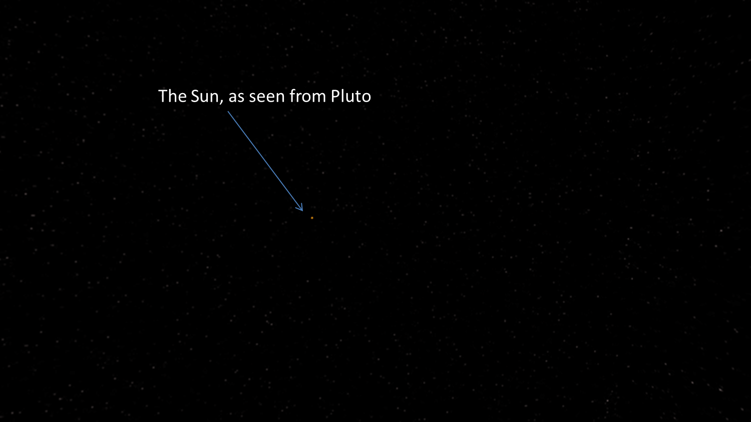
The planets are sized at a relative scale, instead of being scientifically accurate. This means Jupiter fills up your screen, but you can still see details on Pluto’s surface. Each planet scene has the Sun on the opposite side. The sun’s size is set to an accurate scale. Pluto is 40 times further away from the Sun than Earth, so in the Pluto scene the Sun is a tiny yellow dot in the distance. In the Mercury scene the Sun is very close, almost as big as in the Sun’s own scene.
Text Boxes and Fun Facts
The text boxes are essential to accomplishing VR Universe’s main goal: education. This means that they must be scientifically accurate, as well as readable and interesting. To ensure this is the case all of the fun facts and data are from solarsystem.nasa.gov, the authoritative NASA website on the planets, sun and the rest of our solar system. Each statistic and detail is based upon NASA missions and scientific surveys, so they are as accurate as possible.
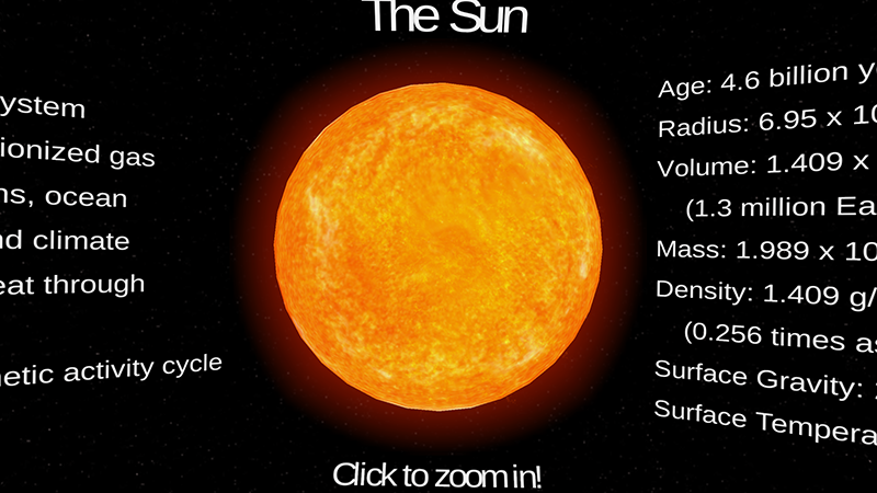
Because there is so much scientific literature and so much known about the sun and each of the planets, it is necessary to pick the facts with care. One consideration is the scientific background of the user. We want VR Universe to be usable by people of all backgrounds, so none of the information can be too technical or assume too much familiarity with the language of space science. On the left side of the sun and each planet are a series of more qualitative features, such as the general environment of the astronomical body, interesting geological and atmospheric features and the origin of its name. On the right side a text box describes it more quantitatively by giving numerical values for the mass, volume, density, surface gravity, temperature, length of day and length of year. Some of these numbers can be confusing however. When I say that Mercury’s radius is 2.4397 x 10³ km, what does that really mean? Is that big or small? For that reason we use the Earth as a reference when describing many planetary features. It is hard for our minds to grasp how large the Earth itself is, but it can still serve as a good point of comparison for many features. By also including the fact that Mercury’s radius is 0.3829 times Earth’s radius, we are able to give the user a sense of scale and a way to understand our solar system in relative terms.
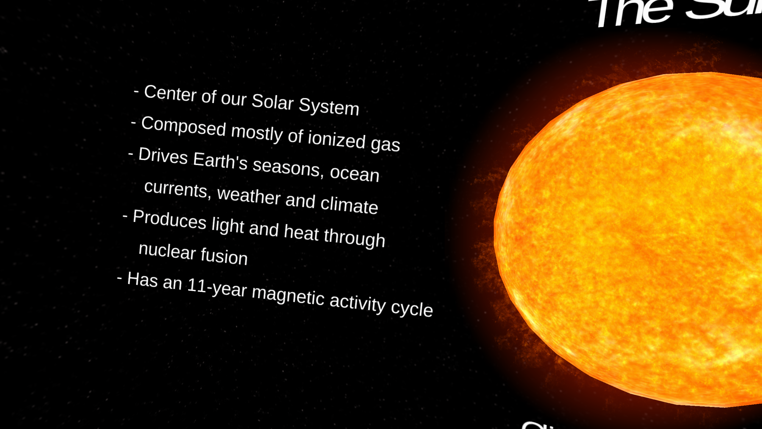
One challenge of developing a virtual reality education app is that the text has to be readable in 3D with the Google Cardboard. This means it has to be close to the user and large enough to read without overwhelming them or dominating the visuals of the planetary models. It also needs to be readable in the 2D version for people who do not have a Google Cardboard or simply want to enjoy the app in that way. The info boxes are created in Unity as 3D Text Boxes which act as 3D objects that can be moved, rotated and stretched within the 3D Unity scene. Each planet requires its own tinkering so that the text is placed naturally. For some of the smaller planets the text looks best when it is directly next to the planet and slightly rotated towards the left and right eye cameras. Many of the larger planets and the sun require more creative placement. This includes placing the text far to the left and right of the planet and rotating it to a series degree so that the user has to turn their head a significant amount to read it. In other cases the text is placed in front of the planets so that it is more easily read. The most interesting example is Saturn. Saturn’s scene has the text closer to the camera than the planet of Saturn is because the rings of Saturn extend quite a ways towards the user in the 3D space. The text then looks like it is floating on the outer rings, or is at least in their vicinity. Attempting to place the text in another way makes it unreadable because it is either obscured by the rings or the user has to turn their head nearly 90 degrees in either direction in order to read it.
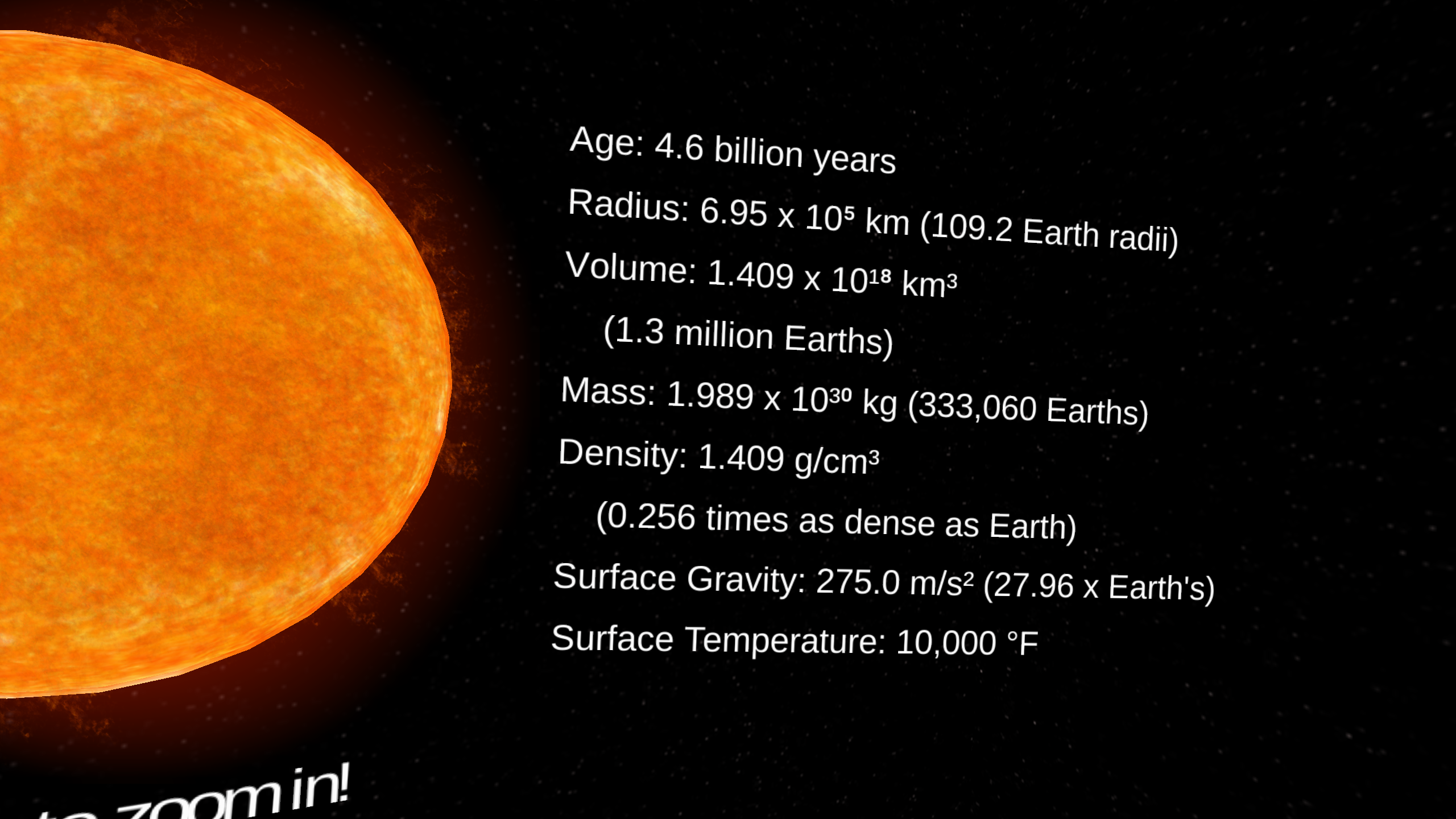
Each astronomical body also has a title above it. These are above the sun/planet and are tilted down slightly so that they are facing the user directly. Below each planet there is fourth text box that says “Tap to Zoom In!” This is necessary because navigation in Unity is limited, and the user needs to understand how to go down to the molecular level and then return to the menu. Each of these text boxes rests in a place with the left and right info boxes so that the information looks consistent to the user and isn’t disorienting.
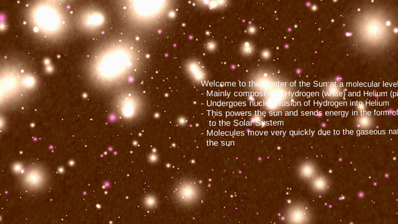
The molecule scenes each have a textbox which is constructed in the same way as those at the planetary level. Each of these details the chemical composition of the inside of the planet, describes what elements/compounds each of the differently colored particles corresponds to and tells of any exciting processes that occur in the interior, such as nuclear fusion in the sun. These info boxes present a special challenge because they must be readable while all of the particles are bouncing around in both the foreground and background. Thus they have to be large enough to read amidst all the chaos and detailed enough to be educationally worthwhile. We ensure both of these are the case by making them non-intrusive but bold and bright.
Molecules
All planets now have a scene that shows some part of their molecular makeup! The inner planets were fairly straightforward, with their cores being mostly comprised of heavy metals like iron and nickel in either a solid or molten form. The molecules scenes were more difficult to implement for the outer planets (Jupiter through Neptune plus Pluto) due to the much lower knowledge base we have about these planets. The molecular scene of the sun shows both hydrogen and helium, with much more of the former. The amount of hydrogen in the sun is so much greater because the sun’s nuclear fusion is driven by the combining of four hydrogen molecules into one helium molecule. This process generates the heat and light we associate with the star in the form of energetic photons that are sent to all corners of the solar system.
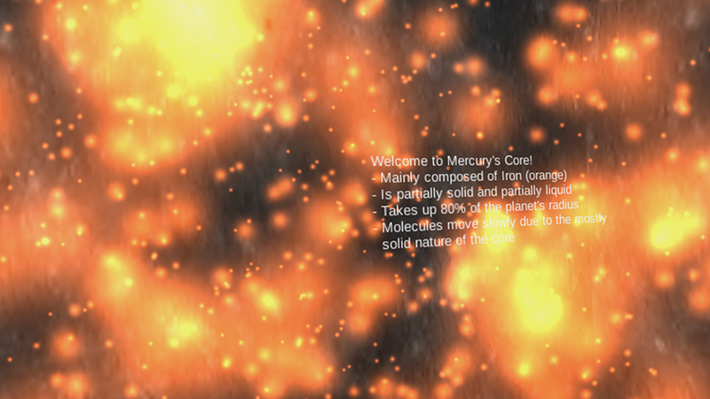
Mercury, Venus, Earth, and Mars all have cores with very well known and very similar molecular makeups, making these molecular scenes the easiest to implement. The elements in the core remained very similar between them all, the main differences came in the molecules’ speeds which depended simply upon the state of matter in the core. Gaseous molecules move much faster than molecules in liquids, and molecules in a solid are almost completely stationary, and usually in some kind of a lattice formation.
For Jupiter and Saturn the molecular display ended up showing the layer of conducting liquid hydrogen surrounding the core of the planet rather than the actual core, which is thought to be comprised of solid material of some sort, but they are just too far away and too big for us to know for sure at this point in the exploration of the Solar System.
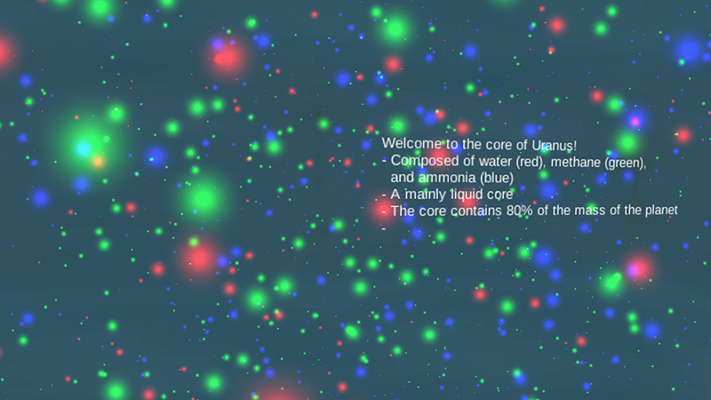
The core of Uranus is composed mainly of chemical compounds like methane, ammonia, and water rather than singular elements like most of the planets, however these were approximated to singular spheres for each compound, which was explained in the text box associated with the molecule scene.
Finally, both Neptune and Pluto have cores made up of what is most likely some kind of generic “rocky material” which was also approximated with a simple sphere. Unfortunately they are just too far away from earth to have sustained the same kind of intense and thorough study as the inner planets, though this level of observation is sure to come soon to all of the outer planets.
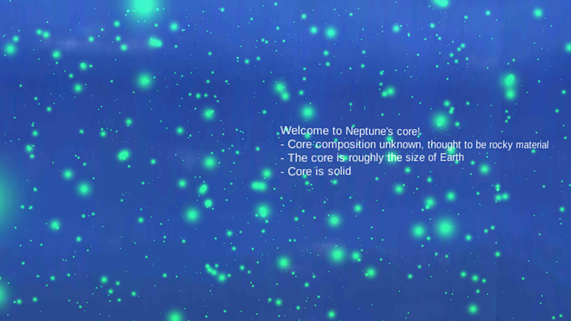
Each planet has its own individual molecular scene associated with the main scene already in existence for each planet. The molecules are approximated using multiple particle systems within each scene. The particle systems are a game object within unity that emit a certain number of particles/second randomly either from the shell of a shape, or the center of said shape. The lifetimes of these particles can be adjusted, as well as color and size. The speed of each particle can also be manipulated, and the natural forces felt by molecules were attempted to be approximated within the particle systems as well. With all that can be done with the unity object of particle systems, these objects were used to model the complex interactions of molecules using the various ways the particles can be emitted, as well as the above possible manipulations of speed and force pertaining to each particle over its lifetime. When multiple particle systems work together, the chaotic looking result interprets well the concept of a gaseous, liquid or even solid planetary core at a molecular level.
Menus
The menu has been revamped! In the early stages of VR Universe the menu was very simplified and consisted of a canvas with buttons indicating where the user can go. It now has models all the planets and the sun that can be selected to go to that celestial body. When you hover over the planet or star, it lights up indicating which planet or star you are about to visit. There’s also a settings button that you can click to go to the settings menu.
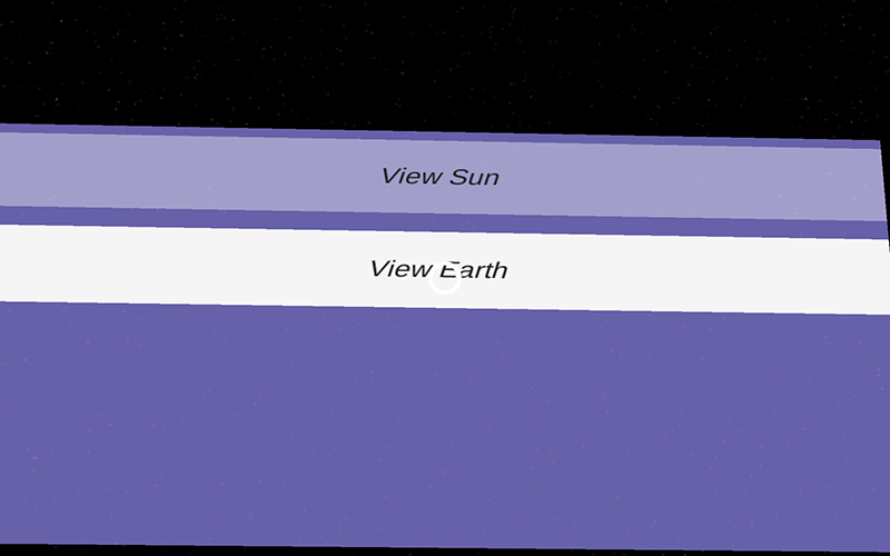
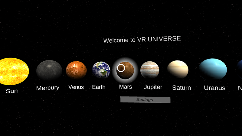
Designing the new menu was fairly difficult, and each section had its quirks. Let’s start with the halo around a planet when you hover. Placing the light was easy but turning it on and off was the hard part. Unity3D GameObject class has a method called SetActive which is used to enable or disable objects. It works pretty well for turning off but once the object is disabled it isn’t able to interact with any scripts associated with it. So when the lights go out, they stay out. The fix was instead of disabling the lights, changing their intensity. This kept the object active and while still appearing to turn the lights on and off. The next issue was that the lights turned on and off when the mouse cursor was over a planet. In the VR world there is no mouse cursor. This was bad because the event that trigger the intensity change was a mouse over. This issue was a bit trickier to find the fix because it involved searching through the Ali to see if there was a similar event to a mouse over that correlated to the cardboard. Luckily, there was gaze enter and gaze exit events the cardboard reticle scripts recognized.
A settings menu was recently added to VR Universe. This features radio boxes that allows you to choose whether you want info boxes on and what age group you prefer. And there is also a checkbox so you can decide if you want 3D mode on or off. These options work by changing the values of global variables. Before each scene is displayed it checks the values of these variables so it knows what to render for the user.
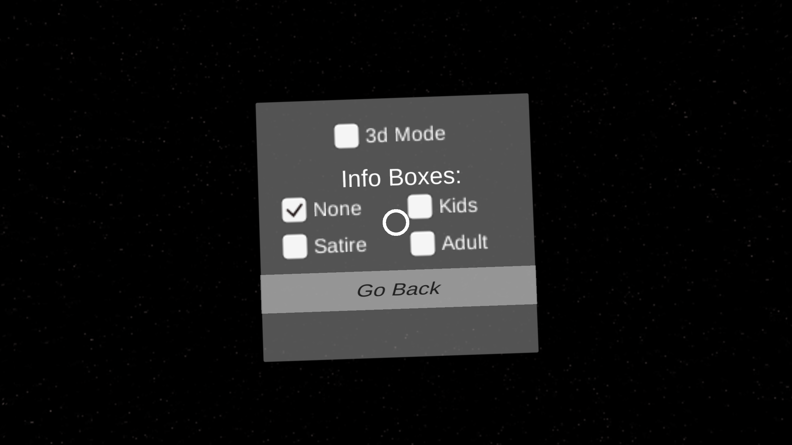
As VR Universe grows, more and more features will change how the menu will look. The goal is to have high appeal while still maintaining intuitive actions and functionality.
Launching into the Real World
Look for us in the Google Play store in the coming weeks. We’ll update you here when the app is available.